PCA: reducing dimensions
The scene: there is no target
Until now there was always a y. We were always predicting something.
Now a different situation: you only have X. No answers; nobody labelled anything.
What can you do then? Two things:
- Reduce the dimensions: bring 100 columns down to 10 without losing information (this chapter)
- Grouping: find rows that are alike (Chapter 28)
Step 3 of the protocol
The table in Chapter 1 had this row: "NO target -> Clustering or PCA".
This is that branch. Steps 1-8 of the protocol don't change: you open the file, check the columns, clean. You only turn onto a different road after step 9.
Column names
The rental data has Uzbek column names. xonalar rooms, maydon_m2 area in m², qavat floor, qavatlar_soni floors in the building, metro_km distance to the metro, mebel furnished (0/1), qurilgan_yil year built. The target ijaraga_berildi_30k means rented within 30 days.
The problem: the curse of dimensionality from Chapter 21
import pandas as pd
import numpy as np

r = np.random.default_rng(42)
print("What happens as columns multiply:")
print(f"{'dimension':>9} {'nearest distance':>18} {'farthest':>10} {'ratio':>8}")
print("-" * 49)
for m in [2, 10, 100, 1000]:
    P = r.normal(size=(400, m))
    d = np.linalg.norm(P[1:] - P[0], axis=1)
    print(f"{m:>9} {d.min():>18.3f} {d.max():>10.3f} {d.max()/d.min():>8.2f}")
What happens as columns multiply:
dimension   nearest distance   farthest    ratio
-------------------------------------------------
        2              0.103      4.301    41.62
       10              1.982      6.687     3.37
      100             11.370     16.832     1.48
     1000             41.602     47.110     1.13
The ratio approaches 1: every point ends up equally far away. KNN, SVM, clustering: everything that relies on distance breaks.
The fix: throw away the excess dimensions. But which ones?
The PCA idea: which direction carries the most information
PCA asks the question differently. It doesn't drop columns: it builds new ones.
The idea: find the direction in which the data is most spread out. That direction carries the most information.
import matplotlib.pyplot as plt
from sklearn.decomposition import PCA
from sklearn.preprocessing import StandardScaler

# we show it in two dimensions, so we can see it
X2 = r.multivariate_normal([0, 0], [[3, 2.4], [2.4, 2.2]], size=300)
p2 = PCA(n_components=2).fit(X2)

figure, axes = plt.subplots(1, 2, figsize=(13, 5))
axes[0].scatter(X2[:, 0], X2[:, 1], alpha=.45, s=22, color="#1a73e8")
for ev, vec in zip(p2.explained_variance_, p2.components_):
    axes[0].arrow(0, 0, vec[0]*np.sqrt(ev)*2, vec[1]*np.sqrt(ev)*2,
                  width=.06, color="#c5221f", length_includes_head=True)
axes[0].set_title("The original data and its main directions", fontweight="bold")
axes[0].set_aspect("equal"); axes[0].grid(alpha=.3)

Xp = p2.transform(X2)
axes[1].scatter(Xp[:, 0], Xp[:, 1], alpha=.45, s=22, color="#137333")
axes[1].axhline(0, color="k", lw=.8); axes[1].axvline(0, color="k", lw=.8)
axes[1].set_xlabel("PC1"); axes[1].set_ylabel("PC2")
axes[1].set_title("After PCA: the axes are rotated", fontweight="bold")
axes[1].set_aspect("equal"); axes[1].grid(alpha=.3)
fig("pca_goya.png", caption="The red arrows are the principal components. The longer one is the direction of greatest spread. On the right, those directions become the axes.")

print("How much variance each component explains:")
for i, v in enumerate(p2.explained_variance_ratio_, 1):
    print(f"  PC{i}: {v:.4f}  ({v:.1%})")
print(f"  Total: {p2.explained_variance_ratio_.sum():.4f}")
How much variance each component explains:
  PC1: 0.9629  (96.3%)
  PC2: 0.0371  (3.7%)
  Total: 1.0000
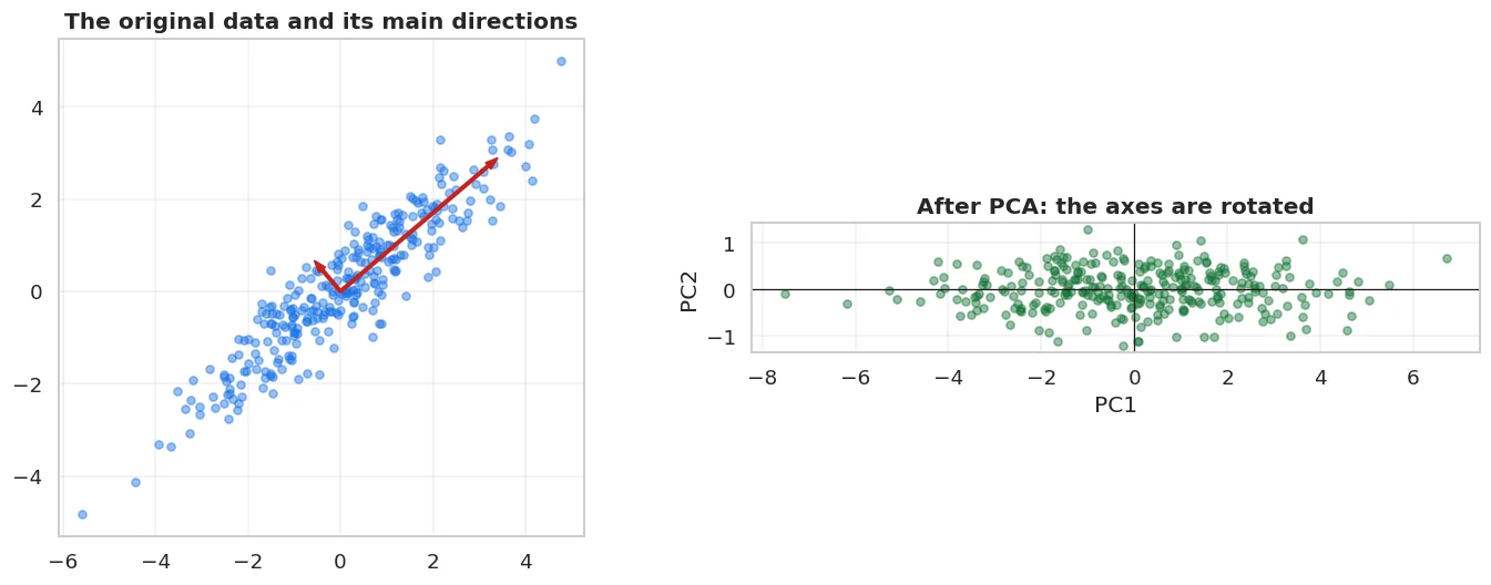
The red arrows are the principal components. The longer one is the direction of greatest spread. On the right, those directions become the axes.
The first component takes most of the variance. If we keep only it, we go from two columns to one and keep most of the information.
Inside PCA: X.T @ X
We saw X.T @ X in Chapter 12. PCA starts from exactly that.
# PCA by hand: the eigenvectors of the covariance matrix
Xm = X2 - X2.mean(axis=0)
cov = (Xm.T @ Xm) / (len(Xm) - 1)
eig_val, eig_vec = np.linalg.eigh(cov)
order = np.argsort(eig_val)[::-1]
eig_val, eig_vec = eig_val[order], eig_vec[:, order]

print("Computed by hand:")
print(f"  eigenvalues : {eig_val.round(4)}")
print(f"  shares      : {(eig_val/eig_val.sum()).round(4)}")
print()
print("sklearn PCA:")
print(f"  variances   : {p2.explained_variance_.round(4)}")
print(f"  shares      : {p2.explained_variance_ratio_.round(4)}")
print()
print(f"Do they match: {bool(np.allclose(eig_val, p2.explained_variance_))}")
Computed by hand:
  eigenvalues : [4.9782 0.1916]
  shares      : [0.9629 0.0371]

sklearn PCA:
  variances   : [4.9782 0.1916]
  shares      : [0.9629 0.0371]

Do they match: True
PCA is the eigenvectors of the covariance matrix. No new maths: just the operations from Chapter 12.
Scaling is MANDATORY for PCA
df = pd.read_csv(DATA / "uy_ijara.csv")
num = ["xonalar", "maydon_m2", "qavat", "qavatlar_soni", "metro_km", "mebel", "qurilgan_yil"]
from sklearn.impute import SimpleImputer
Xd = SimpleImputer(strategy="median").fit_transform(df[num])

print("Column variances (raw):")
for name, v in zip(num, Xd.var(axis=0)):
    print(f"  {name:16s} {v:>12.1f}")
print()
p_raw = PCA().fit(Xd)
p_sc = PCA().fit(StandardScaler().fit_transform(Xd))
print(f"{'component':>10} {'no scaling':>14} {'scaling':>13}")
print("-" * 40)
for i in range(4):
    print(f"{'PC'+str(i+1):>10} {p_raw.explained_variance_ratio_[i]:>14.4f} "
          f"{p_sc.explained_variance_ratio_[i]:>13.4f}")
Column variances (raw):
  xonalar                   1.1
  maydon_m2               405.3
  qavat                    13.0
  qavatlar_soni            18.6
  metro_km                  2.6
  mebel                     0.2
  qurilgan_yil            203.2

 component     no scaling       scaling
----------------------------------------
       PC1         0.6309        0.2781
       PC2         0.3155        0.2312
       PC3         0.0398        0.1479
       PC4         0.0092        0.1406
Without scaling, PC1 takes almost all the variance, because qurilgan_yil's variance is hundreds of times larger than the others'. PCA simply finds that column and doesn't see the rest.
PCA doesn't work without scaling
PCA maximises variance. When the columns are in different units (years, metres, kilometres), the column with the biggest numbers wins, not because it matters, but because its unit is large.
That's why PCA is always applied after StandardScaler. The reason is the same as for Ridge/Lasso (Chapter 17) and KNN (Chapter 21).
How many components to keep
Xs = StandardScaler().fit_transform(Xd)
p = PCA().fit(Xs)
cumulative = np.cumsum(p.explained_variance_ratio_)
table = pd.DataFrame({
    "component": [f"PC{i}" for i in range(1, len(num)+1)],
    "variance share": p.explained_variance_ratio_.round(4),
    "cumulative": cumulative.round(4),
})
show(table)
print()
for target in [0.80, 0.90, 0.95, 0.99]:
    n = int(np.searchsorted(cumulative, target) + 1)
    print(f"  for {target:.0%} of the variance you need {n} components (of {len(num)})")
  for 80% of the variance you need 5 components (of 7)
  for 90% of the variance you need 5 components (of 7)
  for 95% of the variance you need 6 components (of 7)
  for 99% of the variance you need 6 components (of 7)
| component | variance share | cumulative |
|---|---|---|
| PC1 | 0.278 | 0.278 |
| PC2 | 0.231 | 0.509 |
| PC3 | 0.148 | 0.657 |
| PC4 | 0.141 | 0.798 |
| PC5 | 0.138 | 0.936 |
| PC6 | 0.055 | 0.992 |
| PC7 | 0.009 | 1 |
figure, axes = plt.subplots(1, 2, figsize=(13, 4.5))
axes[0].bar(range(1, len(num)+1), p.explained_variance_ratio_, color="#1a73e8", alpha=.85)
axes[0].set_xlabel("Component"); axes[0].set_ylabel("Variance share")
axes[0].set_title("Scree plot: where is the 'elbow'", fontweight="bold")
axes[0].grid(alpha=.3, axis="y")

axes[1].plot(range(1, len(num)+1), cumulative, "o-", lw=2, color="#137333")
for ch in [0.90, 0.95]:
    axes[1].axhline(ch, ls="--", color="gray", lw=1)
    axes[1].text(len(num)*0.6, ch+0.008, f"{ch:.0%}", fontsize=9, color="gray")
axes[1].set_xlabel("Number of components"); axes[1].set_ylabel("Cumulative variance")
axes[1].set_title("How many are enough", fontweight="bold")
axes[1].grid(alpha=.3)
fig("scree.png", caption="Left: each component's share; you look for the 'elbow'. Right: the cumulative share; you pick a 90% or 95% cut-off.")
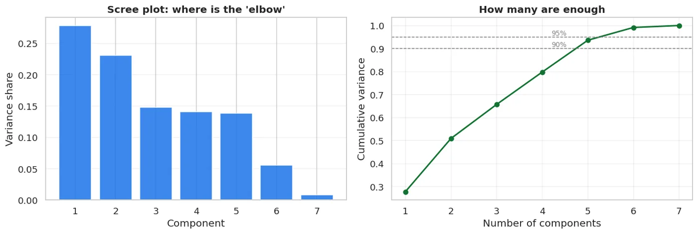
Left: each component's share; you look for the 'elbow'. Right: the cumulative share; you pick a 90% or 95% cut-off.
In sklearn you can pass the cut-off directly:
for ch in [0.90, 0.95]:
    pc = PCA(n_components=ch).fit(Xs)
    print(f"  PCA(n_components={ch}) -> kept {pc.n_components_} components")
  PCA(n_components=0.9) -> kept 5 components
  PCA(n_components=0.95) -> kept 6 components
Does PCA improve a model's result? Let's measure
from sklearn.model_selection import cross_val_score
from sklearn.pipeline import Pipeline
from sklearn.linear_model import LogisticRegression
from sklearn.neighbors import KNeighborsClassifier

y = df["ijaraga_berildi_30k"]
Xf = df[num]

print(f"{'variant':<40} {'CV F1':>9} {'±':>8}")
print("-" * 60)
for name, steps in [
    ("Logistic, NO PCA", [("i", SimpleImputer(strategy="median")), ("sc", StandardScaler()),
                          ("m", LogisticRegression(max_iter=3000))]),
    ("Logistic, PCA(0.95)", [("i", SimpleImputer(strategy="median")), ("sc", StandardScaler()),
                             ("p", PCA(n_components=0.95)), ("m", LogisticRegression(max_iter=3000))]),
    ("Logistic, PCA(2 components)", [("i", SimpleImputer(strategy="median")), ("sc", StandardScaler()),
                                     ("p", PCA(n_components=2)), ("m", LogisticRegression(max_iter=3000))]),
    ("KNN, NO PCA", [("i", SimpleImputer(strategy="median")), ("sc", StandardScaler()),
                     ("m", KNeighborsClassifier(n_neighbors=15))]),
    ("KNN, PCA(0.95)", [("i", SimpleImputer(strategy="median")), ("sc", StandardScaler()),
                        ("p", PCA(n_components=0.95)), ("m", KNeighborsClassifier(n_neighbors=15))]),
]:
    b = cross_val_score(Pipeline(steps), Xf, y, cv=5, scoring="f1")
    print(f"{name:<40} {b.mean():>9.4f} {b.std():>8.4f}")
variant                                      CV F1        ±
------------------------------------------------------------
Logistic, NO PCA                            0.7219   0.0106
Logistic, PCA(0.95)                         0.7251   0.0105
Logistic, PCA(2 components)                 0.7302   0.0091
KNN, NO PCA                                 0.7010   0.0162
KNN, PCA(0.95)                              0.7098   0.0184
PCA isn't for raising accuracy, but it doesn't lower it either
I had written this section as "PCA doesn't help, and sometimes hurts". The measurement didn't confirm that.
Look at the table: every PCA variant came out equal to the baseline or slightly higher. The differences are within the spread, so they're not reliable, but no harm showed up either.
The most interesting result is the PCA(2 components) row: dropping 5 of the 7 columns, the model's result didn't fall.
What does that mean? Our 7 columns don't really carry 7 independent pieces of information. xonalar and maydon_m2 correlate at 0.94 (Chapter 4), and qavat and qavatlar_soni are related too. PCA squeezed out that repetition.
So PCA's real role is removing redundancy, not raising accuracy. It's useful for:
- Very many columns (hundreds, thousands) that are related to each other
- Visualisation: bringing 50 dimensions down to 2 to look at them
- Speed: making training faster
- Reducing noise: the last components are often noise
And one more lesson: I wrote the guess "it hurts", then measured, and it was refuted. Measure every sentence of the form "sometimes this happens", or it stays just a guess.
Where PCA really works: many columns
r2 = np.random.default_rng(7)
# 150 columns, but they're combinations of 8 hidden factors
hidden = r2.normal(size=(len(Xf), 8))
mixing = r2.normal(size=(8, 150))
X_many = pd.DataFrame(hidden @ mixing + r2.normal(scale=.4, size=(len(Xf), 150)),
                      columns=[f"u{i}" for i in range(150)])
# the target is built from the hidden factors
y_many = ((hidden @ r2.normal(size=8) + r2.normal(scale=.5, size=len(Xf))) > 0).astype(int)

import time
print(f"{'variant':<34} {'CV F1':>9} {'±':>8} {'time':>8}")
print("-" * 62)
for name, steps in [
    ("150 columns, NO PCA", [("sc", StandardScaler()), ("m", LogisticRegression(max_iter=3000))]),
    ("PCA(0.95)", [("sc", StandardScaler()), ("p", PCA(n_components=0.95)),
                   ("m", LogisticRegression(max_iter=3000))]),
    ("PCA(8 components)", [("sc", StandardScaler()), ("p", PCA(n_components=8)),
                           ("m", LogisticRegression(max_iter=3000))]),
]:
    t0 = time.perf_counter()
    b = cross_val_score(Pipeline(steps), X_many, y_many, cv=5, scoring="f1")
    dt = time.perf_counter() - t0
    print(f"{name:<34} {b.mean():>9.4f} {b.std():>8.4f} {dt:>7.2f}s")
print()
pk = PCA(n_components=0.95).fit(StandardScaler().fit_transform(X_many))
print(f"PCA(0.95) kept {pk.n_components_} components out of 150 columns")
variant                                CV F1        ±     time
--------------------------------------------------------------
150 columns, NO PCA                   0.9393   0.0111    0.13s
PCA(0.95)                             0.9443   0.0068    0.11s
PCA(8 components)                     0.9443   0.0068    1.72s

PCA(0.95) kept 8 components out of 150 columns
Here PCA works: the 150 columns were really built from 8 hidden factors, and PCA found them.
Visualisation: PCA's most reliable benefit
from sklearn.preprocessing import LabelEncoder
pg = pd.read_csv(DATA / "penguins.csv")
pnum = ["bill_length_mm", "bill_depth_mm", "flipper_length_mm", "body_mass_g"]
Xpg = SimpleImputer(strategy="median").fit_transform(pg[pnum])
Xpg = StandardScaler().fit_transform(Xpg)
species = pg.species.values

p_pg = PCA(n_components=2).fit(Xpg)
Z = p_pg.transform(Xpg)

figure, ax = plt.subplots(figsize=(8.5, 5.5))
for t, colour in zip(["Adelie", "Gentoo", "Chinstrap"], ["#1a73e8", "#137333", "#c5221f"]):
    mask = species == t
    ax.scatter(Z[mask, 0], Z[mask, 1], label=t, alpha=.7, s=30, color=colour)
ax.set_xlabel(f"PC1 ({p_pg.explained_variance_ratio_[0]:.1%})")
ax.set_ylabel(f"PC2 ({p_pg.explained_variance_ratio_[1]:.1%})")
ax.set_title("4-dimensional data in 2 dimensions", fontweight="bold")
ax.legend(); ax.grid(alpha=.3)
fig("pca_penguins.png", caption="Four dimensions brought down to two, and the classes still separate. PCA did NOT see the target: it only looked at the variance.")

print(f"PC1 and PC2 together explain {p_pg.explained_variance_ratio_.sum():.1%} of the variance")
PC1 and PC2 together explain 88.2% of the variance
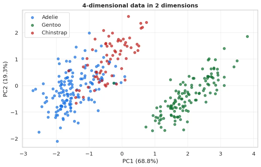
Four dimensions brought down to two, and the classes still separate. PCA did NOT see the target: it only looked at the variance.
Note: PCA didn't see species. It only looked at the four measurements, and the classes separated anyway. That shows there's real structure in this data.
What the components are made of
loadings = pd.DataFrame(p_pg.components_.T, columns=["PC1", "PC2"], index=pnum).round(3)
show(loadings.reset_index().rename(columns={"index": "feature"}))
print()
print("The feature that contributes most to PC1:",
      pnum[int(np.argmax(np.abs(p_pg.components_[0])))])
The feature that contributes most to PC1: flipper_length_mm
| feature | PC1 | PC2 |
|---|---|---|
| bill_length_mm | 0.455 | 0.597 |
| bill_depth_mm | -0.4 | 0.798 |
| flipper_length_mm | 0.576 | 0.002 |
| body_mass_g | 0.548 | 0.084 |
PCA components are hard to interpret
PC1 = 0.45*bill_length - 0.40*bill_depth + 0.58*flipper + 0.55*mass: what does that mean?
Nothing. It's just a mathematical combination. You can't explain it to a customer.
So in projects that need explanations (banking, medicine), be careful with PCA: the model's accuracy is kept, but the SHAP analysis from Chapter 26 loses its meaning: you can't explain the effect of PC3.
The variants
show(pd.DataFrame([
    {"Method": "PCA", "Linear?": "YES", "When": "The general case, fast",
     "Weakness": "Doesn't see non-linear structure"},
    {"Method": "TruncatedSVD", "Linear?": "YES", "When": "Sparse matrices (text, TF-IDF)",
     "Weakness": "Doesn't centre the data"},
    {"Method": "t-SNE", "Linear?": "NO", "When": "ONLY for visualisation",
     "Weakness": "No transform(): you can't add a new point"},
    {"Method": "UMAP", "Linear?": "NO", "When": "Visualisation, faster",
     "Weakness": "A separate library"},
]))
| Method | Linear? | When | Weakness |
|---|---|---|---|
| PCA | YES | The general case, fast | Doesn't see non-linear structure |
| TruncatedSVD | YES | Sparse matrices (text, TF-IDF) | Doesn't centre the data |
| t-SNE | NO | ONLY for visualisation | No transform(): you can't add a new point |
| UMAP | NO | Visualisation, faster | A separate library |
Don't put t-SNE in a model pipeline
t-SNE draws beautiful pictures, and students want to use it instead of PCA.
But t-SNE has no transform(): it only knows fit_transform(). So when a new row arrives, you can't place it in that space.
That means you cannot use t-SNE inside a Pipeline in front of a model. It's only for checking by eye.
What we learned today
show(pd.DataFrame([
    {"Concept": "The task", "In one sentence": "No target: find structure in the data itself"},
    {"Concept": "The PCA idea", "In one sentence": "Turn the directions of greatest variance into axes"},
    {"Concept": "Inside it", "In one sentence": "The eigenvectors of the covariance matrix (Chapter 12)"},
    {"Concept": "Scaling", "In one sentence": "MANDATORY: otherwise the column with big units wins"},
    {"Concept": "How many components", "In one sentence": "Where the cumulative variance reaches 90-95%"},
    {"Concept": "Effect on accuracy", "In one sentence": "Usually none: it removes redundancy, not accuracy"},
    {"Concept": "When it helps", "In one sentence": "Very many columns, visualisation, speed"},
    {"Concept": "The cost", "In one sentence": "Components can't be explained: SHAP loses its meaning"},
]))
| Concept | In one sentence |
|---|---|
| The task | No target: find structure in the data itself |
| The PCA idea | Turn the directions of greatest variance into axes |
| Inside it | The eigenvectors of the covariance matrix (Chapter 12) |
| Scaling | MANDATORY: otherwise the column with big units wins |
| How many components | Where the cumulative variance reaches 90-95% |
| Effect on accuracy | Usually none: it removes redundancy, not accuracy |
| When it helps | Very many columns, visualisation, speed |
| The cost | Components can't be explained: SHAP loses its meaning |
Next chapter: we reduced the dimensions. Now we split the rows into groups.
Questions about this chapter?
The course, homework review and the other five books are in Uzbek. Questions in English are welcome on Telegram.