Visualisation: looking at the data
The scene: you can't read 1200 rows
The data has arrived. You ran df.head() and saw 5 rows. You ran df.describe() and got a table of numbers.
But one question is still open: what does this data actually look like?
Are prices bunched together or spread out? Are there two or three strange values? Does the distance to the metro affect the price?
You can't answer these questions by staring at a table. Looking at a chart, you answer them in a second.
This chapter completes step 1 of the protocol: you opened the file, now look at it.
Column names
The data is synthetic Tashkent rental listings, and its column names are Uzbek, so they also appear as axis labels below. tuman district, xonalar rooms, maydon_m2 area in m², qavat floor, qavatlar_soni floors in the building, metro_km distance to the metro, mebel furnished (0/1), narx_usd monthly rent in USD. The target ijaraga_berildi_30k means rented within 30 days.
Why seaborn, isn't matplotlib enough
matplotlib is the foundation, and it can do anything. But it makes you write a lot of code even for simple things.
One question: "what is the average price in each district?"
import pandas as pd
import numpy as np
import matplotlib.pyplot as plt
import seaborn as sns

sns.set_theme(style="whitegrid", font_scale=1.05)
df = pd.read_csv(DATA / "uy_ijara.csv")

# The MATPLOTLIB way: group by hand, place by hand
figure, axes = plt.subplots(1, 2, figsize=(14, 4.8))

g = df.groupby("tuman").narx_usd.mean().sort_values()
axes[0].barh(range(len(g)), g.values, color="#5f6368")
axes[0].set_yticks(range(len(g)))
axes[0].set_yticklabels(g.index)
axes[0].set_xlabel("Average price (USD)")
axes[0].set_title("matplotlib: 6 lines of code", fontweight="bold")

# The SEABORN way: one line
sns.barplot(data=df, y="tuman", x="narx_usd", estimator="mean",
            errorbar=None, ax=axes[1], order=g.index, color="#1a73e8")
axes[1].set_xlabel("Average price (USD)")
axes[1].set_title("seaborn: 1 line of code", fontweight="bold")

fig("matplotlib_vs_seaborn.png", caption="The same result. On the left we group by hand, on the right seaborn groups for us.")
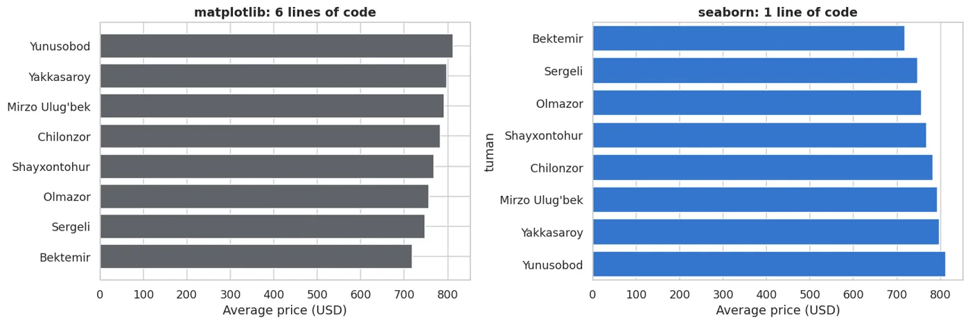
The same result. On the left we group by hand, on the right seaborn groups for us.
Seaborn understands a DataFrame: you give it a column name, and it does the grouping, computing and drawing itself.
The rule
matplotlib is for fine-tuning (axis names, colours, sizes). seaborn is for creating the chart.
They work together: seaborn draws, matplotlib adjusts. That's what the code above does too.
Distribution: what does one column look like
The first question is always this: how are the values spread?
figure, axes = plt.subplots(1, 3, figsize=(15, 4.2))

sns.histplot(data=df, x="narx_usd", bins=35, kde=True, ax=axes[0], color="#1a73e8")
axes[0].set_title("histplot: shape")

sns.boxplot(data=df, x="narx_usd", ax=axes[1], color="#43a047")
axes[1].set_title("boxplot: median, quartiles, outliers")

sns.violinplot(data=df, x="narx_usd", ax=axes[2], color="#8e24aa")
axes[2].set_title("violinplot: shape + quartiles")

fig("taqsimot.png", caption="One column, three views. histplot shows the shape, boxplot shows the extreme values.")
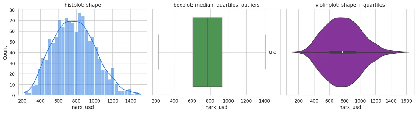
One column, three views. histplot shows the shape, boxplot shows the extreme values.
Now the most important habit: check what the chart told you with a number.
print(df.narx_usd.describe().round(1).to_string())
print()
q1, q3 = df.narx_usd.quantile([0.25, 0.75])
iqr = q3 - q1
outliers = df[(df.narx_usd < q1 - 1.5 * iqr) | (df.narx_usd > q3 + 1.5 * iqr)]
print(f"Interquartile range (IQR): {iqr:.0f}")
print(f"Rows the boxplot marks as outliers: {len(outliers)} ({len(outliers)/len(df):.1%})")
count    1200.0
mean      776.1
std       229.5
min       225.0
25%       608.8
50%       767.5
75%       935.0
max      1515.0

Interquartile range (IQR): 326
Rows the boxplot marks as outliers: 4 (0.3%)
An outlier is NOT always a mistake
The boxplot showed dots, but that doesn't mean "bad data". Tashkent really does have expensive flats.
The rule: read an outlier before you drop it. If it's real, keep it. If price = 999999, it's a data-entry error; drop it.
Relationships: is there a link between two columns
figure, axes = plt.subplots(1, 2, figsize=(14, 4.8))

sns.scatterplot(data=df, x="maydon_m2", y="narx_usd", hue="mebel",
                alpha=.55, ax=axes[0], palette=["#c5221f", "#137333"])
axes[0].set_title("Area and price (colour = furnished)")

sns.scatterplot(data=df, x="metro_km", y="narx_usd", alpha=.45, ax=axes[1], color="#1a73e8")
sns.regplot(data=df, x="metro_km", y="narx_usd", scatter=False, ax=axes[1], color="#c5221f")
axes[1].set_title("Distance to metro and price (red line = trend)")

fig("boglanish.png", caption="Left: price rises with area. Right: price falls further from the metro, but the spread is wide.")
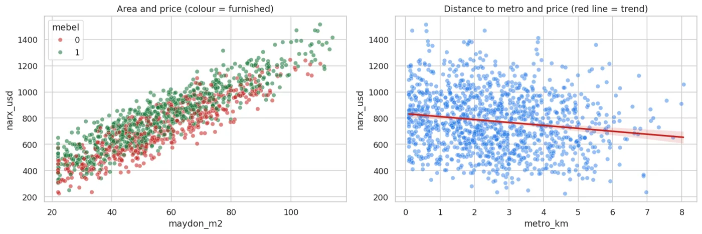
Left: price rises with area. Right: price falls further from the metro, but the spread is wide.
The chart showed a trend. Now we measure its strength:
num_cols = ["xonalar", "maydon_m2", "qavat", "qavatlar_soni", "metro_km", "mebel", "narx_usd"]
corr = df[num_cols].corr()
print("Correlation with narx_usd:")
print(corr["narx_usd"].drop("narx_usd").sort_values(ascending=False).round(3).to_string())
Correlation with narx_usd:
maydon_m2        0.889
xonalar          0.869
mebel            0.206
qavatlar_soni    0.076
qavat            0.062
metro_km        -0.156
figure, ax = plt.subplots(figsize=(8.5, 6.5))
sns.heatmap(corr, annot=True, fmt=".2f", cmap="RdBu_r", center=0,
            square=True, linewidths=.5, ax=ax, cbar_kws={"shrink": .8})
ax.set_title("Correlation matrix", fontweight="bold")
fig("heatmap.png", caption="Red = positive relationship, blue = negative. Note the 0.94 between xonalar and maydon_m2.")
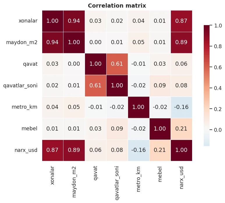
Red = positive relationship, blue = negative. Note the 0.94 between xonalar and maydon_m2.
On a heatmap, look AWAY FROM THE DIAGONAL first
The diagonal is always 1.00: every column is perfectly related to itself. That tells you nothing.
The interesting spot: 0.94 between xonalar and maydon_m2. They say almost the same thing (a big flat has many rooms).
This is multicollinearity. It makes a linear model's coefficients unstable (Chapter 17), but it often doesn't affect prediction accuracy. In Chapter 42 I got exactly this wrong.
Category charts
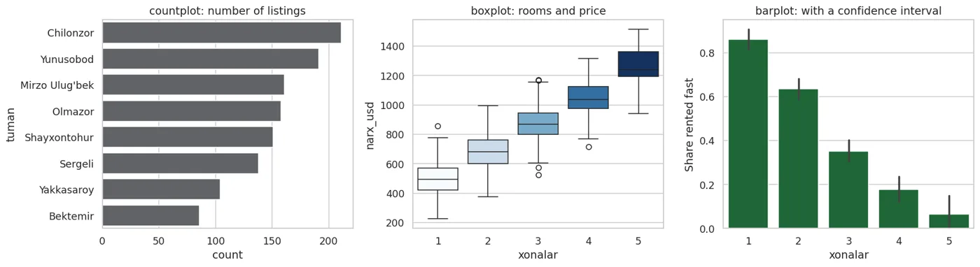
figure, axes = plt.subplots(1, 3, figsize=(16, 4.5))

sns.countplot(data=df, y="tuman", ax=axes[0], color="#5f6368",
              order=df.tuman.value_counts().index)
axes[0].set_title("countplot: number of listings")

sns.boxplot(data=df, x="xonalar", y="narx_usd", ax=axes[1], hue="xonalar",
            legend=False, palette="Blues")
axes[1].set_title("boxplot: rooms and price")

sns.barplot(data=df, x="xonalar", y="ijaraga_berildi_30k", ax=axes[2],
            errorbar=("ci", 95), color="#137333")
axes[2].set_ylabel("Share rented fast")
axes[2].set_title("barplot: with a confidence interval")

fig("kategoriya.png", caption="countplot shows counts, boxplot the distribution, barplot the mean (with a confidence interval).")
countplot shows counts, boxplot the distribution, barplot the mean (with a confidence interval).
The small vertical lines on the third chart are 95% confidence intervals. They matter: if two bars' lines overlap, the difference between them is not reliable.
print("Share rented fast, by number of rooms:")
g = df.groupby("xonalar").agg(n=("ijaraga_berildi_30k", "size"),
                              fast_share=("ijaraga_berildi_30k", "mean"))
g["fast_share"] = g.fast_share.round(3)
print(g.to_string())
print()
print("NOTE: there are few 5-room flats, so their share is not trustworthy.")
Share rented fast, by number of rooms:
           n  fast_share
xonalar
1        222       0.860
2        412       0.636
3        345       0.351
4        174       0.178
5         47       0.064

NOTE: there are few 5-room flats, so their share is not trustworthy.
Don't trust the average of a small group
In the table above there are only a few dozen 5-room flats. Their "share rented fast" depends heavily on chance.
The rule: always show the number of rows in each group. barplot draws a pretty bar, but it doesn't tell you whether there are 3 rows or 300 behind it.
Many dimensions: hue, col, row
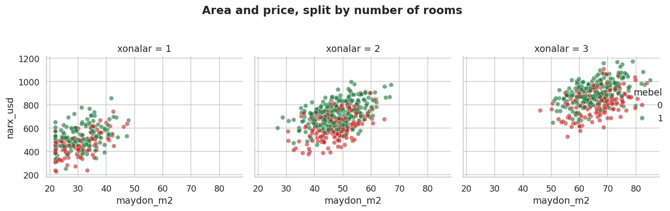
Seaborn's greatest strength is showing three or four dimensions in one line.
subset = df[df.xonalar.isin([1, 2, 3])]
g = sns.relplot(data=subset, x="maydon_m2", y="narx_usd",
                hue="mebel", col="xonalar", kind="scatter",
                height=3.8, aspect=1.05, alpha=.6,
                palette=["#c5221f", "#137333"])
g.figure.suptitle("Area and price, split by number of rooms", y=1.04, fontweight="bold")
fig("relplot.png", caption="col='xonalar' created three panels. hue='mebel' added a fourth dimension as colour.")
col='xonalar' created three panels. hue='mebel' added a fourth dimension as colour.
Four dimensions in one chart: area (x), price (y), furnished (colour), rooms (panel).
Which chart, when
show(pd.DataFrame([
    {"Question": "How is one numeric column distributed?", "Chart": "histplot", "Extra": "kde=True smooths the shape"},
    {"Question": "Are there outliers?", "Chart": "boxplot", "Extra": "Dots = outside the IQR"},
    {"Question": "Is there a link between two numbers?", "Chart": "scatterplot", "Extra": "regplot adds a trend line"},
    {"Question": "All numeric columns against each other?", "Chart": "heatmap(corr)", "Extra": "or pairplot (slow)"},
    {"Question": "How many rows per category?", "Chart": "countplot", "Extra": "sort with order="},
    {"Question": "The mean per category?", "Chart": "barplot", "Extra": "DON'T turn off the errorbar"},
    {"Question": "The distribution per category?", "Chart": "boxplot / violinplot", "Extra": "tells you more than a barplot"},
    {"Question": "Change over time?", "Chart": "lineplot", "Extra": "the x axis should be a date"},
    {"Question": "Three or four dimensions together?", "Chart": "relplot / catplot", "Extra": "hue, col, row"},
]))
| Question | Chart | Extra |
|---|---|---|
| How is one numeric column distributed? | histplot | kde=True smooths the shape |
| Are there outliers? | boxplot | Dots = outside the IQR |
| Is there a link between two numbers? | scatterplot | regplot adds a trend line |
| All numeric columns against each other? | heatmap(corr) | or pairplot (slow) |
| How many rows per category? | countplot | sort with order= |
| The mean per category? | barplot | DON'T turn off the errorbar |
| The distribution per category? | boxplot / violinplot | tells you more than a barplot |
| Change over time? | lineplot | the x axis should be a date |
| Three or four dimensions together? | relplot / catplot | hue, col, row |
The most important chart for ML: splitting by the target
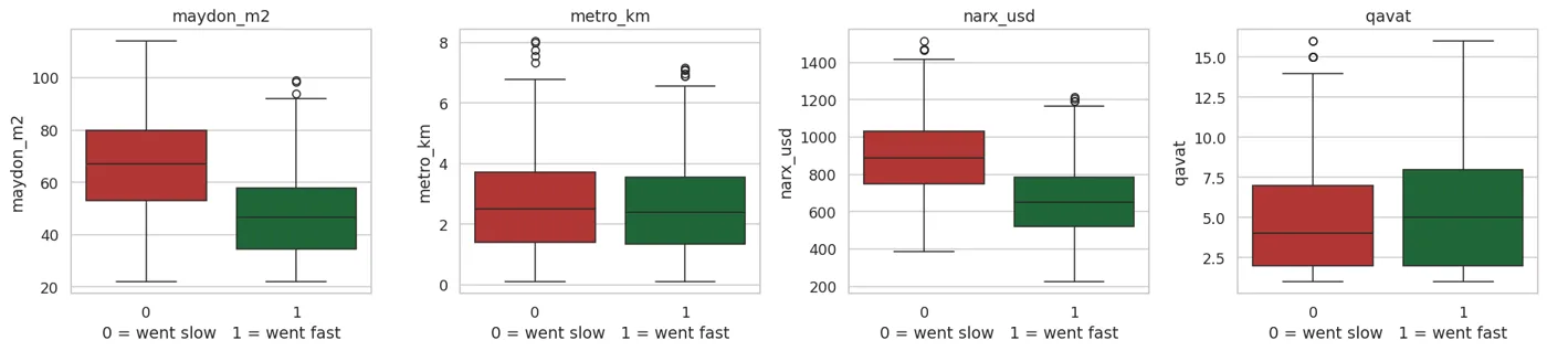
Before moving on to a model, draw one chart: does each feature separate the target?
figure, axes = plt.subplots(1, 4, figsize=(17, 4))
for ax, c in zip(axes, ["maydon_m2", "metro_km", "narx_usd", "qavat"]):
    sns.boxplot(data=df, x="ijaraga_berildi_30k", y=c, ax=ax,
                hue="ijaraga_berildi_30k", legend=False, palette=["#c5221f", "#137333"])
    ax.set_xlabel("0 = went slow   1 = went fast")
    ax.set_title(c)
fig("target_ajratish.png", caption="The further apart the boxes are, the more useful that feature is.")
The further apart the boxes are, the more useful that feature is.
print("How strongly each feature separates the target:")
rows = []
for c in ["maydon_m2", "metro_km", "narx_usd", "qavat", "xonalar", "mebel"]:
    a = df[df.ijaraga_berildi_30k == 0][c].mean()
    b = df[df.ijaraga_berildi_30k == 1][c].mean()
    pooled_std = df[c].std()
    rows.append({"Column": c, "Slow mean": round(a, 2), "Fast mean": round(b, 2),
                 "Separation": round(abs(b - a) / pooled_std, 3)})
show(pd.DataFrame(rows).sort_values("Separation", ascending=False))
How strongly each feature separates the target:
| Column | Slow mean | Fast mean | Separation |
|---|---|---|---|
| narx_usd | 894.46 | 660.86 | 1.018 |
| maydon_m2 | 67.22 | 47.41 | 0.983 |
| xonalar | 3.03 | 2 | 0.963 |
| qavat | 4.99 | 5.21 | 0.06 |
| metro_km | 2.62 | 2.55 | 0.048 |
| mebel | 0.61 | 0.62 | 0.018 |
The last column is the difference scaled by the standard deviation. The larger it is, the more useful the feature.
Notice: narx_usd separates best. That makes sense: a cheap flat goes faster. But we don't use it as a feature, because it is the second target (Chapter 1, step 7).
Polishing for a report
sns.set_theme(style="whitegrid", font_scale=1.1)
figure, ax = plt.subplots(figsize=(10, 5))
g = df.groupby("tuman").agg(avg=("narx_usd", "mean"),
                            n=("narx_usd", "size")).sort_values("avg")
sns.barplot(x=g.avg, y=g.index, ax=ax, color="#1a73e8")
for i, (v, n) in enumerate(zip(g.avg, g.n)):
    ax.text(v + 8, i, f"{v:.0f} USD  (n={n})", va="center", fontsize=9.5, color="#333")
ax.set_xlabel("Average rent, USD/month")
ax.set_ylabel("")
ax.set_title("Average rent by Tashkent district", fontweight="bold", pad=14)
ax.set_xlim(0, g.avg.max() * 1.28)
sns.despine(left=True, bottom=True)
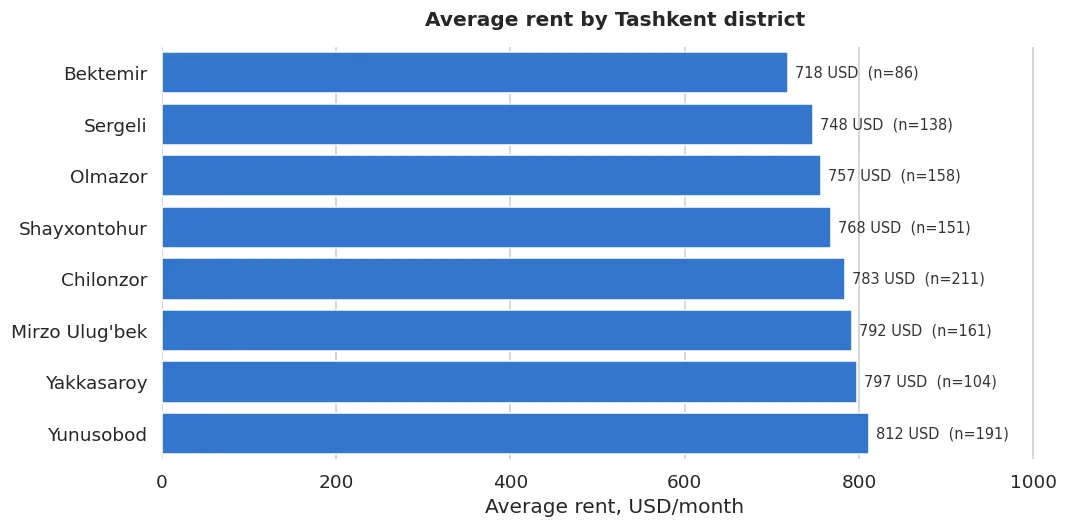
fig("hisobot.png", caption="A report-ready chart: the values are written, the group size (n) is shown, the clutter is removed.")
A report-ready chart: the values are written, the group size (n) is shown, the clutter is removed.
The three rules of a report chart: write the value, show the group size (n=), remove the clutter.
What we learned today
show(pd.DataFrame([
    {"Rule": "Look first, build the model later", "Why": "A chart tells you more in a second than a table"},
    {"Rule": "seaborn speaks DataFrame", "Why": "You give a column name; it groups and draws"},
    {"Rule": "Check the chart WITH A NUMBER", "Why": "Eyes deceive; describe() and corr() confirm"},
    {"Rule": "Show the group size", "Why": "The mean of a 3-row group means nothing"},
    {"Rule": "Don't turn off the errorbar", "Why": "Overlapping intervals = the difference isn't reliable"},
    {"Rule": "Read an outlier before dropping it", "Why": "Not all of them are mistakes; some are real"},
    {"Rule": "Split by the target", "Why": "It shows in advance which features are useful"},
]))
| Rule | Why |
|---|---|
| Look first, build the model later | A chart tells you more in a second than a table |
| seaborn speaks DataFrame | You give a column name; it groups and draws |
| Check the chart WITH A NUMBER | Eyes deceive; describe() and corr() confirm |
| Show the group size | The mean of a 3-row group means nothing |
| Don't turn off the errorbar | Overlapping intervals = the difference isn't reliable |
| Read an outlier before dropping it | Not all of them are mistakes; some are real |
| Split by the target | It shows in advance which features are useful |
Next chapter: we looked at the data and found the problems. Now we fix them, getting the data into a shape the model accepts.
Questions about this chapter?
The course, homework review and the other five books are in Uzbek. Questions in English are welcome on Telegram.