SHAP: explaining the model
The scene: "why was it rejected?"
Your model works. The manager is happy. Then a customer calls:
"Why was my listing marked 'goes slow'?"
What do you say? "Most of the 200 trees in the Random Forest voted that way" is not an answer.
This chapter gives you the tool that answers that question.
Column names
The data is synthetic Tashkent rental listings, and its column names are Uzbek. xonalar rooms, maydon_m2 area in m², qavat floor, qavatlar_soni floors in the building, metro_km distance to the metro, mebel furnished (0/1). The target ijaraga_berildi_30k means rented within 30 days.
Two kinds of question, two kinds of tool
import pandas as pd
import numpy as np
show(pd.DataFrame([
    {"Question": "What does the model look at IN GENERAL?", "Name": "Global explanation",
     "Tools": "feature_importances_, permutation importance, SHAP summary"},
    {"Question": "Why was THIS ROW scored this way?", "Name": "Local explanation",
     "Tools": "SHAP waterfall, LIME"},
]))
| Question | Name | Tools |
|---|---|---|
| What does the model look at IN GENERAL? | Global explanation | feature_importances_, permutation importance, SHAP summary |
| Why was THIS ROW scored this way? | Local explanation | SHAP waterfall, LIME |
In Chapter 18 we saw global explanations (feature_importances_ and permutation). But neither of them answers the local question.
SHAP gives you both.
Building the model
from sklearn.model_selection import train_test_split
from sklearn.ensemble import RandomForestClassifier

df = pd.read_csv(DATA / "uy_ijara.csv")
num = ["xonalar", "maydon_m2", "qavat", "qavatlar_soni", "metro_km", "mebel"]
X, y = df[num], df["ijaraga_berildi_30k"]
X_tr, X_te, y_tr, y_te = train_test_split(X, y, test_size=0.3, random_state=42, stratify=y)

model = RandomForestClassifier(n_estimators=200, min_samples_leaf=10, random_state=42).fit(X_tr, y_tr)
print(f"test accuracy: {model.score(X_te, y_te):.4f}")
print()
print("The old way, feature_importances_:")
for name, v in sorted(zip(num, model.feature_importances_), key=lambda x: -x[1]):
    print(f"  {name:16s} {v:.4f}")
print()
print("The problem: this says NOTHING about any one flat.")
test accuracy: 0.7750

The old way, feature_importances_:
  maydon_m2        0.4548
  xonalar          0.2437
  metro_km         0.1361
  qavatlar_soni    0.0877
  qavat            0.0626
  mebel            0.0151

The problem: this says NOTHING about any one flat.
The SHAP idea: a fair split
SHAP comes from game theory (Shapley, 1951). The question is framed like this:
FAIRLY split, among the features, the contribution that moved the prediction from the average to this value.
"Fair" means: each feature's contribution equals its average effect across every possible combination of features.
The result is one equation:
import shap

explainer = shap.TreeExplainer(model)
sh = explainer(X_te)
values = sh.values[:, :, 1] if sh.values.ndim == 3 else sh.values
base = sh.base_values[0, 1] if np.ndim(sh.base_values) > 1 else sh.base_values[0]

print(f"Shape of the SHAP values: {values.shape}  -> one number per ROW and per COLUMN")
print(f"Base value (the average prediction): {base:.4f}")
print()
# we check the equation
i = 0
total = base + values[i].sum()
actual = model.predict_proba(X_te.iloc[[i]])[0, 1]
print(f"Check for row 1:")
print(f"  base + sum of SHAP = {base:.4f} + {values[i].sum():+.4f} = {total:.4f}")
print(f"  the model's actual prediction        = {actual:.4f}")
print(f"  do they match: {bool(np.isclose(total, actual, atol=1e-6))}")
Shape of the SHAP values: (360, 6)  -> one number per ROW and per COLUMN
Base value (the average prediction): 0.5072

Check for row 1:
  base + sum of SHAP = 0.5072 + -0.2555 = 0.2517
  the model's actual prediction        = 0.2517
  do they match: True
The equation holds exactly. That's SHAP's core guarantee, and it's why you can trust its result.
A local explanation: one flat
i = 0
row = X_te.iloc[i]
contrib = pd.DataFrame({
    "feature": num,
    "value": row.values,
    "SHAP contribution": values[i].round(4),
}).sort_values("SHAP contribution", key=abs, ascending=False)
contrib["direction"] = ["towards going FAST" if v > 0 else "towards going SLOW"
                        for v in contrib["SHAP contribution"]]
show(contrib)
print()
print(f"Average prediction   : {base:.4f}")
print(f"Sum of contributions : {values[i].sum():+.4f}")
print(f"This flat's prediction: {model.predict_proba(X_te.iloc[[i]])[0, 1]:.4f}")
print(f"The true answer      : {y_te.iloc[i]}")
Average prediction   : 0.5072
Sum of contributions : -0.2555
This flat's prediction: 0.2517
The true answer      : 1
| feature | value | SHAP contribution | direction |
|---|---|---|---|
| maydon_m2 | 79.2 | -0.175 | towards going SLOW |
| xonalar | 4 | -0.124 | towards going SLOW |
| qavat | 9 | 0.021 | towards going FAST |
| metro_km | 2.01 | 0.021 | towards going FAST |
| mebel | 0 | 0.008 | towards going FAST |
| qavatlar_soni | 10 | -0.007 | towards going SLOW |
There's the answer for the customer. Read the first row of the table and you give a precise reason.
import matplotlib.pyplot as plt
figure, ax = plt.subplots(figsize=(9.5, 4.5))
order = np.argsort(np.abs(values[i]))
colours = ["#137333" if values[i][k] > 0 else "#c5221f" for k in order]
ax.barh(range(len(order)), values[i][order], color=colours, alpha=.85)
ax.set_yticks(range(len(order)))
ax.set_yticklabels([f"{num[k]} = {row.values[k]:.4g}" for k in order])
ax.axvline(0, color="k", lw=1)
ax.set_xlabel("SHAP contribution (effect on the probability)")
ax.set_title(f"One flat: average {base:.3f} -> prediction {base + values[i].sum():.3f}",
             fontweight="bold")
ax.grid(alpha=.3, axis="x")
fig("shap_lokal.png", caption="Green pushes towards going fast, red towards going slow. The length shows the strength of the contribution.")
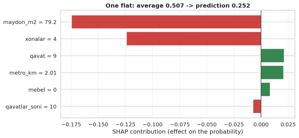
Green pushes towards going fast, red towards going slow. The length shows the strength of the contribution.
A global explanation: the SHAP average
The mean absolute value of the local contributions gives global importance, and it's more reliable than feature_importances_.
from sklearn.inspection import permutation_importance
pi = permutation_importance(model, X_te, y_te, n_repeats=20, random_state=42, scoring="f1")

compare = pd.DataFrame({
    "feature": num,
    "feature_importances_": model.feature_importances_.round(4),
    "permutation": pi.importances_mean.round(4),
    "SHAP (|mean|)": np.abs(values).mean(axis=0).round(4),
}).sort_values("SHAP (|mean|)", ascending=False)
show(compare)
print()
print("Check whether the three columns agree on the order.")
Check whether the three columns agree on the order.
| feature | feature_importances_ | permutation | SHAP (|mean|) |
|---|---|---|---|
| maydon_m2 | 0.455 | 0.145 | 0.095 |
| xonalar | 0.244 | 0.086 | 0.091 |
| qavatlar_soni | 0.088 | 0.001 | 0.019 |
| metro_km | 0.136 | -0.006 | 0.014 |
| qavat | 0.063 | 0.004 | 0.013 |
| mebel | 0.015 | -0.005 | 0.004 |
figure, axes = plt.subplots(1, 2, figsize=(14, 4.8))

# summary bar
order_g = np.argsort(np.abs(values).mean(axis=0))
axes[0].barh(range(len(num)), np.abs(values).mean(axis=0)[order_g], color="#1a73e8", alpha=.85)
axes[0].set_yticks(range(len(num)))
axes[0].set_yticklabels([num[k] for k in order_g])
axes[0].set_xlabel("mean |SHAP|")
axes[0].set_title("Global importance", fontweight="bold")
axes[0].grid(alpha=.3, axis="x")

# instead of a beeswarm: value vs SHAP for the most important feature
top = int(np.argmax(np.abs(values).mean(axis=0)))
axes[1].scatter(X_te.iloc[:, top], values[:, top], alpha=.5, s=22, c="#c5221f")
axes[1].axhline(0, color="k", lw=1, ls="--")
axes[1].set_xlabel(num[top])
axes[1].set_ylabel(f"SHAP contribution")
axes[1].set_title(f"The value of '{num[top]}' and its effect", fontweight="bold")
axes[1].grid(alpha=.3)
fig("shap_global.png", caption="Left: which features matter overall. Right: how the effect of the most important feature changes as its value rises.")
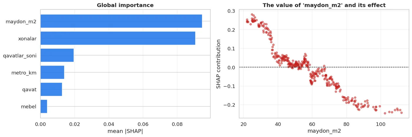
Left: which features matter overall. Right: how the effect of the most important feature changes as its value rises.
The chart on the right is very valuable: it shows whether a feature's effect is linear or not. If the points form a curve, the relationship is non-linear.
Why SHAP beats feature_importances_
show(pd.DataFrame([
    {"Property": "Local (one-row) explanation", "feature_importances_": "NO", "SHAP": "YES"},
    {"Property": "Direction (raises/lowers)", "feature_importances_": "NO", "SHAP": "YES (the sign)"},
    {"Property": "Sums to the prediction", "feature_importances_": "NO", "SHAP": "YES (guaranteed)"},
    {"Property": "Bias towards many-valued columns", "feature_importances_": "YES (a problem)", "SHAP": "Less"},
    {"Property": "Cost to compute", "feature_importances_": "Free", "SHAP": "Expensive"},
]))
| Property | feature_importances_ | SHAP |
|---|---|---|
| Local (one-row) explanation | NO | YES |
| Direction (raises/lowers) | NO | YES (the sign) |
| Sums to the prediction | NO | YES (guaranteed) |
| Bias towards many-valued columns | YES (a problem) | Less |
| Cost to compute | Free | Expensive |
import time
print("The cost to compute, measured:")
t0 = time.perf_counter(); _ = model.feature_importances_; t1 = time.perf_counter()
print(f"  feature_importances_ : {(t1-t0)*1000:.3f} ms")
t0 = time.perf_counter(); _ = shap.TreeExplainer(model)(X_te); t1 = time.perf_counter()
print(f"  SHAP (TreeExplainer) : {(t1-t0)*1000:.1f} ms  (for {len(X_te)} rows)")
t0 = time.perf_counter()
_ = permutation_importance(model, X_te, y_te, n_repeats=20, random_state=42, scoring="f1")
t1 = time.perf_counter()
print(f"  permutation (20 times): {(t1-t0)*1000:.1f} ms")
The cost to compute, measured:
  feature_importances_ : 4.042 ms
  SHAP (TreeExplainer) : 164.4 ms  (for 360 rows)
  permutation (20 times): 836.9 ms
TreeExplainer is fast, KernelExplainer is very slow
SHAP has several explainers:
TreeExplainer: for tree models (RF, XGBoost, LightGBM). Exact and fast.LinearExplainer: for linear models. Fast.KernelExplainer: for any model, but approximate and very slow.
Use KernelExplainer on 1000 rows and you may wait several minutes. That's why it's usually run on a sample of 50-100 rows.
SHAP for a linear model: checking against the coefficients
from sklearn.linear_model import LogisticRegression
from sklearn.preprocessing import StandardScaler
from sklearn.pipeline import Pipeline

sc = StandardScaler().fit(X_tr)
lr = LogisticRegression(max_iter=3000).fit(sc.transform(X_tr), y_tr)

lin_exp = shap.LinearExplainer(lr, sc.transform(X_tr))
lin_sh = lin_exp(sc.transform(X_te))

compare2 = pd.DataFrame({
    "feature": num,
    "coefficient": lr.coef_[0].round(4),
    "SHAP |mean|": np.abs(lin_sh.values).mean(axis=0).round(4),
}).sort_values("SHAP |mean|", ascending=False)
show(compare2)
print()
print("In a linear model, SHAP = coefficient x (value - mean).")
print("So the order MATCHES the absolute size of the coefficients.")
In a linear model, SHAP = coefficient x (value - mean).
So the order MATCHES the absolute size of the coefficients.
| feature | coefficient | SHAP |mean| |
|---|---|---|
| maydon_m2 | -0.945 | 0.726 |
| xonalar | -0.175 | 0.146 |
| qavat | 0.086 | 0.07 |
| metro_km | 0.041 | 0.032 |
| qavatlar_soni | -0.028 | 0.024 |
| mebel | -0.021 | 0.021 |
SHAP does not show causality
This is the most common mistake. SHAP tells you "how the model relied on this feature". It does NOT mean "if we change that feature, the result will change".
Example: the model relies on metro_km. But SHAP doesn't prove that moving a flat closer to the metro would make it rent faster: it only explains the model's decision.
Causality needs an experiment: an A/B test (in the Data Analytics course) or causal inference methods.
Be careful with customers too: "the model scored your listing low because it's far from the metro" is correct. "Move closer to the metro and it'll rent faster" is something SHAP doesn't say.
Practical use: in error analysis
SHAP's most powerful use is deepening the error analysis from Chapter 11.
pred = model.predict(X_te)
wrong_mask = (pred != y_te.to_numpy())
print(f"Rows it got wrong: {wrong_mask.sum()} / {len(y_te)}")
print()
cmp = pd.DataFrame({
    "feature": num,
    "|SHAP| on correct rows": np.abs(values[~wrong_mask]).mean(axis=0).round(4),
    "|SHAP| on WRONG rows": np.abs(values[wrong_mask]).mean(axis=0).round(4),
})
cmp["diff"] = (cmp["|SHAP| on WRONG rows"] - cmp["|SHAP| on correct rows"]).round(4)
show(cmp.sort_values("diff", key=abs, ascending=False))
print()
print("The feature with the biggest difference is exactly where the model gets confused.")
Rows it got wrong: 81 / 360


The feature with the biggest difference is exactly where the model gets confused.
| feature | |SHAP| on correct rows | |SHAP| on WRONG rows | diff |
|---|---|---|---|
| maydon_m2 | 0.107 | 0.052 | -0.055 |
| xonalar | 0.096 | 0.073 | -0.023 |
| qavatlar_soni | 0.019 | 0.022 | 0.003 |
| metro_km | 0.013 | 0.016 | 0.002 |
| qavat | 0.013 | 0.012 | -0.001 |
| mebel | 0.004 | 0.004 | 0.001 |
This table answers Chapter 11's "which group do the mistakes cluster in" question at the feature level.
What we learned today
show(pd.DataFrame([
    {"Concept": "Global vs local", "In one sentence": "What the model looks at overall / why this row came out this way"},
    {"Concept": "The SHAP idea", "In one sentence": "Split the prediction's gap from the average fairly"},
    {"Concept": "The guarantee", "In one sentence": "base + sum of SHAP = EXACTLY the prediction"},
    {"Concept": "The sign", "In one sentence": "Positive pushes towards the target, negative away"},
    {"Concept": "TreeExplainer", "In one sentence": "Exact and fast for trees"},
    {"Concept": "KernelExplainer", "In one sentence": "Any model, but slow: take a sample"},
    {"Concept": "The biggest mistake", "In one sentence": "Reading SHAP as CAUSALITY"},
    {"Concept": "Practical value", "In one sentence": "Takes error analysis down to the feature level"},
]))
| Concept | In one sentence |
|---|---|
| Global vs local | What the model looks at overall / why this row came out this way |
| The SHAP idea | Split the prediction's gap from the average fairly |
| The guarantee | base + sum of SHAP = EXACTLY the prediction |
| The sign | Positive pushes towards the target, negative away |
| TreeExplainer | Exact and fast for trees |
| KernelExplainer | Any model, but slow: take a sample |
| The biggest mistake | Reading SHAP as CAUSALITY |
| Practical value | Takes error analysis down to the feature level |
That completes Part 5. You now know four ways to improve a model: new features (23), tuning (24), combining (25) and explaining (26).
The next part moves to the case where there is no target.
Questions about this chapter?
The course, homework review and the other five books are in Uzbek. Questions in English are welcome on Telegram.