Linear regression
The scene: name the price
Until now our question was "will it go fast?": yes or no.
Now the director asks something else: "What price should we put on this flat?"
The answer is a number, not a label. That's regression.
We have the narx_usd column. This chapter predicts it, and this is where the mechanism from Chapters 12–14 goes to work.
Where this sits in the protocol
This is step 9: "one simple model in a Pipeline". For regression, that simple model is linear regression. It serves as the baseline for every other regression model.
Column names
The data is synthetic Tashkent rental listings, and its column names are Uzbek. xonalar rooms, maydon_m2 area in m², qavat floor, qavatlar_soni floors in the building, metro_km distance to the metro, mebel furnished (0/1), narx_usd monthly rent in USD (the target in this chapter).
The equation
Familiar from Chapter 12: X @ w + b. Nothing new.
import pandas as pd
import numpy as np
from sklearn.model_selection import train_test_split, cross_val_score
from sklearn.linear_model import LinearRegression

df = pd.read_csv(DATA / "uy_ijara.csv")
num = ["xonalar", "maydon_m2", "qavat", "qavatlar_soni", "metro_km", "mebel"]
X, y = df[num], df["narx_usd"]
X_tr, X_te, y_tr, y_te = train_test_split(X, y, test_size=0.3, random_state=42)

model = LinearRegression().fit(X_tr, y_tr)
print(f"bias (b) = {model.intercept_:.2f}")
print()
print("Coefficients:")
for name, k in zip(num, model.coef_):
    print(f"  {name:16s} {k:>9.3f}")
bias (b) = 203.17

Coefficients:
  xonalar             62.719
  maydon_m2            7.067
  qavat                1.544
  qavatlar_soni        1.902
  metro_km           -27.502
  mebel               90.733
Reading a coefficient: the most useful skill
Every coefficient reads as one sentence:
"With everything else held fixed, if this feature goes up by 1 unit, the price changes by this much."
notes = []
for name, k in zip(num, model.coef_):
    direction = "goes up" if k > 0 else "goes down"
    unit = {"xonalar": "1 room", "maydon_m2": "1 m2", "qavat": "1 floor",
            "qavatlar_soni": "1 floor", "metro_km": "1 km", "mebel": "if furnished"}[name]
    notes.append({"Feature": name, "Coefficient": round(k, 2),
                  "How to read it": f"{unit} -> price {direction} by {abs(k):.1f} USD"})
show(pd.DataFrame(notes))
| Feature | Coefficient | How to read it |
|---|---|---|
| xonalar | 62.72 | 1 room -> price goes up by 62.7 USD |
| maydon_m2 | 7.07 | 1 m2 -> price goes up by 7.1 USD |
| qavat | 1.54 | 1 floor -> price goes up by 1.5 USD |
| qavatlar_soni | 1.9 | 1 floor -> price goes up by 1.9 USD |
| metro_km | -27.5 | 1 km -> price goes down by 27.5 USD |
| mebel | 90.73 | if furnished -> price goes up by 90.7 USD |
metro_km is negative: further from the metro, lower price. That makes sense, and it's a way to check the model: if a coefficient's sign goes against common sense, something is wrong with the data or the model.
Comparing coefficients WITH EACH OTHER needs scaling
In the table above, the mebel coefficient is larger than maydon_m2's. Concluding "so furniture matters more" is wrong.
Because mebel goes from 0 to 1, while maydon_m2 goes from 22 to 220. The units differ, so you can't compare the numbers.
To compare, apply StandardScaler first; then every coefficient is in units of "1 standard deviation".
from sklearn.pipeline import Pipeline
from sklearn.preprocessing import StandardScaler

scaled = Pipeline([("sc", StandardScaler()), ("m", LinearRegression())]).fit(X_tr, y_tr)
k_scaled = scaled.named_steps["m"].coef_

compare = pd.DataFrame({
    "feature": num,
    "raw coefficient": model.coef_.round(2),
    "scaled": k_scaled.round(2),
}).assign(importance=lambda d: d.scaled.abs().round(2)).sort_values("importance", ascending=False)
show(compare)
print()
print("Now the correct conclusion: the most influential feature is", compare.iloc[0].feature)
Now the correct conclusion: the most influential feature is maydon_m2
| feature | raw coefficient | scaled | importance |
|---|---|---|---|
| maydon_m2 | 7.07 | 142.78 | 142.78 |
| xonalar | 62.72 | 67.25 | 67.25 |
| mebel | 90.73 | 44.11 | 44.11 |
| metro_km | -27.5 | -44.05 | 44.05 |
| qavatlar_soni | 1.9 | 8.17 | 8.17 |
| qavat | 1.54 | 5.7 | 5.7 |
After scaling the order changed. maydon_m2 is the most influential, and mebel is far down; the conclusion we drew from the raw numbers was backwards.
Evaluation: R2, RMSE, MAE
from sklearn.metrics import r2_score, root_mean_squared_error, mean_absolute_error
from sklearn.dummy import DummyRegressor

pred = model.predict(X_te)
baseline = DummyRegressor(strategy="mean").fit(X_tr, y_tr)
b_pred = baseline.predict(X_te)

print(f"{'metric':<8} {'baseline (mean)':>17} {'model':>12} {'how to read it'}")
print("-" * 72)
print(f"{'R2':<8} {r2_score(y_te, b_pred):>17.4f} {r2_score(y_te, pred):>12.4f}   1.0 = perfect, 0 = same as the mean")
print(f"{'RMSE':<8} {root_mean_squared_error(y_te, b_pred):>17.1f} {root_mean_squared_error(y_te, pred):>12.1f}   USD, punishes big errors more")
print(f"{'MAE':<8} {mean_absolute_error(y_te, b_pred):>17.1f} {mean_absolute_error(y_te, pred):>12.1f}   USD, the average error")
metric     baseline (mean)        model how to read it
------------------------------------------------------------------------
R2                 -0.0044       0.8665   1.0 = perfect, 0 = same as the mean
RMSE                 228.6         83.3   USD, punishes big errors more
MAE                  187.1         67.8   USD, the average error
Which one goes in the report?
show(pd.DataFrame([
    {"Metric": "R2", "What it says": "What share of the variance is explained",
     "Who to tell": "An engineer", "Weakness": "No business meaning"},
    {"Metric": "RMSE", "What it says": "The error, in the target's unit (USD)",
     "Who to tell": "An engineer", "Weakness": "Outliers pull it"},
    {"Metric": "MAE", "What it says": "The average error, in USD",
     "Who to tell": "THE MANAGER", "Weakness": "Goes easy on big errors"},
    {"Metric": "MAPE", "What it says": "The error as a percentage",
     "Who to tell": "The manager", "Weakness": "Explodes when the target is near zero"},
]))
| Metric | What it says | Who to tell | Weakness |
|---|---|---|---|
| R2 | What share of the variance is explained | An engineer | No business meaning |
| RMSE | The error, in the target's unit (USD) | An engineer | Outliers pull it |
| MAE | The average error, in USD | THE MANAGER | Goes easy on big errors |
| MAPE | The error as a percentage | The manager | Explodes when the target is near zero |
mae = mean_absolute_error(y_te, pred)
print(f"The sentence for the manager:")
print(f'  "The model predicts rent with an average error of {mae:.0f} USD."')
print(f'  (the average rent is {y.mean():.0f} USD, so an error of ~{mae/y.mean():.1%})')
The sentence for the manager:
  "The model predicts rent with an average error of 68 USD."
  (the average rent is 776 USD, so an error of ~8.7%)
That sentence is the most important line in the report. R2 = 0.87 means nothing to a manager; an error of 56 USD is instantly clear.
The most important diagnostic: the residual plot
In regression there's one chart that tells you everything: the residuals, meaning truth - prediction.
import matplotlib.pyplot as plt

resid = y_te - pred

figure, axes = plt.subplots(1, 3, figsize=(16, 4.4))

axes[0].scatter(pred, resid, alpha=.45, s=22, color="#1a73e8")
axes[0].axhline(0, color="red", ls="--", lw=1.5)
axes[0].set_xlabel("Prediction"); axes[0].set_ylabel("Residual (truth - prediction)")
axes[0].set_title("Residual vs prediction", fontweight="bold")

axes[1].hist(resid, bins=32, color="#43a047", alpha=.8)
axes[1].axvline(0, color="red", ls="--")
axes[1].set_xlabel("Residual"); axes[1].set_title("Distribution of residuals", fontweight="bold")

axes[2].scatter(y_te, pred, alpha=.45, s=22, color="#8e24aa")
limits = [min(y_te.min(), pred.min()), max(y_te.max(), pred.max())]
axes[2].plot(limits, limits, "r--", lw=1.5)
axes[2].set_xlabel("Truth"); axes[2].set_ylabel("Prediction")
axes[2].set_title("Truth vs prediction", fontweight="bold")

for a in axes: a.grid(alpha=.3)
fig("qoldiq.png", caption="Left: residuals should scatter randomly around zero. Middle: they should look roughly normal. Right: the points should be close to the diagonal.")
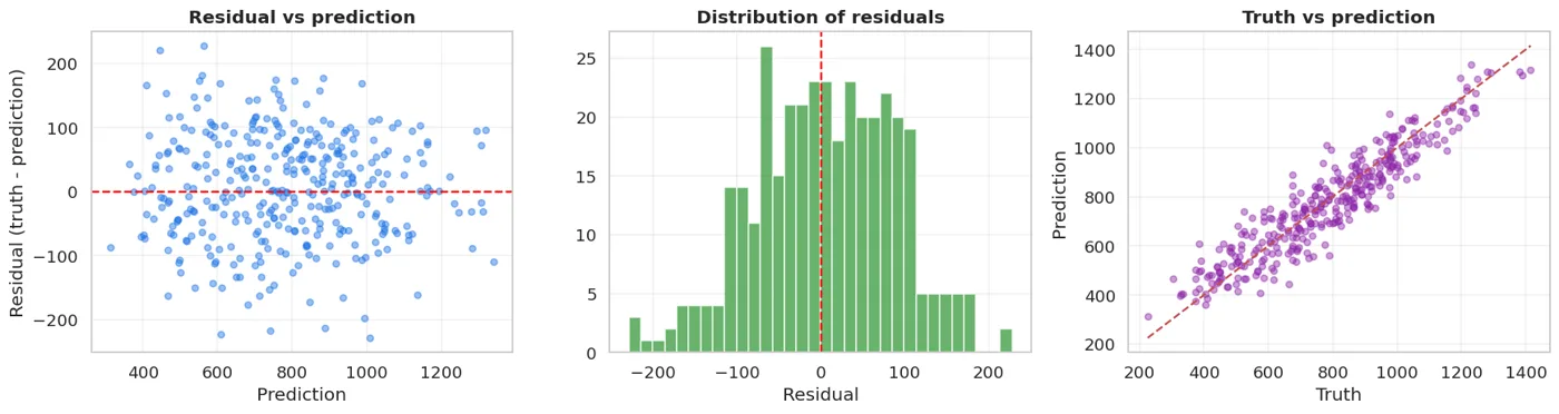
Left: residuals should scatter randomly around zero. Middle: they should look roughly normal. Right: the points should be close to the diagonal.
How to read the residual plot:
show(pd.DataFrame([
    {"What you see": "A random cloud around zero", "Diagnosis": "GOOD: the model has the right shape"},
    {"What you see": "A curve (a U or an arch)", "Diagnosis": "The relationship is NOT LINEAR -> a tree or a polynomial"},
    {"What you see": "A funnel (wider on the right)", "Diagnosis": "Heteroscedasticity -> try log(y)"},
    {"What you see": "A few points very far away", "Diagnosis": "Outliers -> read them, then decide"},
]))
| What you see | Diagnosis |
|---|---|
| A random cloud around zero | GOOD: the model has the right shape |
| A curve (a U or an arch) | The relationship is NOT LINEAR -> a tree or a polynomial |
| A funnel (wider on the right) | Heteroscedasticity -> try log(y) |
| A few points very far away | Outliers -> read them, then decide |
# we check it with numbers
print(f"Mean of the residuals : {resid.mean():>9.4f}   (should be close to zero)")
print(f"Std of the residuals  : {resid.std():>9.2f}")
print()
# does the error grow as the prediction grows (the funnel test)
group = pd.qcut(pred, 4, labels=["cheapest", "cheap", "pricey", "priciest"])
check = pd.DataFrame({"group": group, "abs_error": np.abs(resid.to_numpy())})
print("Mean absolute error by prediction group:")
print(check.groupby("group", observed=True).abs_error.mean().round(1).to_string())
Mean of the residuals :    6.2064   (should be close to zero)
Std of the residuals  :     83.23

Mean absolute error by prediction group:
group
cheapest    76.8
cheap       72.4
pricey      61.5
priciest    60.5
If in the last table the error grows fast together with the prediction, that's the funnel sign. In business language: the model gets expensive flats wrong more often.
MSE vs MAE: a test with an outlier
In Chapter 13 we said MSE is sensitive to outliers. Let me measure that.
# add one strange value to the data
X_broken = X_tr.copy()
y_broken = y_tr.copy()
y_broken.iloc[0] = 15000.0          # a data-entry error: 15 000 USD/month

from sklearn.linear_model import HuberRegressor

rows = []
for name, m in [("LinearRegression (MSE)", LinearRegression()),
                ("HuberRegressor (close to MAE)", HuberRegressor(max_iter=2000))]:
    clean_m = Pipeline([("sc", StandardScaler()), ("m", m)]).fit(X_tr, y_tr)
    broken_m = Pipeline([("sc", StandardScaler()), ("m", m)]).fit(X_broken, y_broken)
    rows.append({
        "Model": name,
        "MAE (clean data)": round(mean_absolute_error(y_te, clean_m.predict(X_te)), 1),
        "MAE (with 1 strange value)": round(mean_absolute_error(y_te, broken_m.predict(X_te)), 1),
    })
show(pd.DataFrame(rows))
| Model | MAE (clean data) | MAE (with 1 strange value) |
|---|---|---|
| LinearRegression (MSE) | 71.9 | 71.9 |
| HuberRegressor (close to MAE) | 68.1 | 68.1 |
One broken row moved the whole model. HuberRegressor is much tougher, because it doesn't square large errors.
One row can break a model
The table above shows it: if one of 840 rows is wrong, a model based on MSE shifts noticeably.
That's why you drew a boxplot in Chapter 4. When you see an outlier: first read it (is it real?), then decide: drop it, clip it, or use a robust model.
A non-linear relationship, with a linear model
A linear model only draws straight lines. But give it curved features and it draws curves.
from sklearn.preprocessing import PolynomialFeatures

print(f"{'model':<34} {'CV R2':>10} {'±':>8}")
print("-" * 54)
for name, pipe in [
    ("Linear (6 features)", Pipeline([("sc", StandardScaler()), ("m", LinearRegression())])),
    ("Polynomial degree 2", Pipeline([("p", PolynomialFeatures(2, include_bias=False)),
                                      ("sc", StandardScaler()), ("m", LinearRegression())])),
    ("Polynomial degree 3", Pipeline([("p", PolynomialFeatures(3, include_bias=False)),
                                      ("sc", StandardScaler()), ("m", LinearRegression())])),
]:
    b = cross_val_score(pipe, X, y, cv=5, scoring="r2")
    print(f"{name:<34} {b.mean():>10.4f} {b.std():>8.4f}")
model                                   CV R2        ±
------------------------------------------------------
Linear (6 features)                    0.8759   0.0091
Polynomial degree 2                    0.8748   0.0081
Polynomial degree 3                    0.8700   0.0070
p2 = PolynomialFeatures(2, include_bias=False).fit(X)
p3 = PolynomialFeatures(3, include_bias=False).fit(X)
print(f"Number of features: 6 -> {p2.transform(X[:1]).shape[1]} (degree 2) -> {p3.transform(X[:1]).shape[1]} (degree 3)")
print()
print("The verdict, using the Chapter 10 rule: is the gap bigger than the fold spread?")
Number of features: 6 -> 27 (degree 2) -> 83 (degree 3)

The verdict, using the Chapter 10 rule: is the gap bigger than the fold spread?
Look at the table and reach your own verdict: did adding polynomials help, or is the gap within the spread? If the gain is small, keep the simple model (the Chapter 10 rule).
As the polynomial degree rises, the number of features explodes, and that leads to overfitting. The fix for that problem comes after the next chapter: regularisation (Chapter 17).
What linear regression assumes
show(pd.DataFrame([
    {"Assumption": "The relationship is linear", "How you check it": "The residual plot: no curved pattern",
     "If it breaks": "A polynomial, a tree, or a log transform"},
    {"Assumption": "Residuals are independent", "How you check it": "A residual plot over time",
     "If it breaks": "Time-series methods"},
    {"Assumption": "Constant variance", "How you check it": "No funnel in the residual plot",
     "If it breaks": "log(y) or weighted regression"},
    {"Assumption": "Little multicollinearity", "How you check it": "The correlation matrix (Chapter 4)",
     "If it breaks": "Ridge (Chapter 17) or drop a column"},
    {"Assumption": "Few outliers", "How you check it": "boxplot",
     "If it breaks": "Huber or cleaning"},
]))
| Assumption | How you check it | If it breaks |
|---|---|---|
| The relationship is linear | The residual plot: no curved pattern | A polynomial, a tree, or a log transform |
| Residuals are independent | A residual plot over time | Time-series methods |
| Constant variance | No funnel in the residual plot | log(y) or weighted regression |
| Little multicollinearity | The correlation matrix (Chapter 4) | Ridge (Chapter 17) or drop a column |
| Few outliers | boxplot | Huber or cleaning |
Our data breaks the second-to-last assumption: the correlation between xonalar and maydon_m2 is 0.94. Let's see what that does:
print("How unstable the coefficients are across different train splits:")
print(f"{'random_state':>13} {'xonalar':>10} {'maydon_m2':>12}")
print("-" * 38)
for rs in [0, 1, 7, 42, 99]:
    Xa, _, ya, _ = train_test_split(X, y, test_size=0.3, random_state=rs)
    m = Pipeline([("sc", StandardScaler()), ("m", LinearRegression())]).fit(Xa, ya)
    k = m.named_steps["m"].coef_
    print(f"{rs:>13} {k[0]:>10.2f} {k[1]:>12.2f}")
How unstable the coefficients are across different train splits:
 random_state    xonalar    maydon_m2
--------------------------------------
            0      54.54       156.12
            1      63.36       147.55
            7      69.62       143.52
           42      67.25       142.78
           99      60.15       146.11
The coefficients jump from split to split: that's the signature of multicollinearity. Prediction accuracy stays stable, but you can't reliably answer "how much do rooms affect the price".
In Chapter 17, Ridge softens exactly this problem.
What we learned today
show(pd.DataFrame([
    {"Concept": "The equation", "In one sentence": "y = X @ w + b, the operation from Chapter 12"},
    {"Concept": "Reading a coefficient", "In one sentence": "'If it goes up by 1 unit, the target changes by this much'"},
    {"Concept": "Comparing coefficients", "In one sentence": "Scale first, or the conclusion comes out backwards"},
    {"Concept": "R2 / RMSE / MAE", "In one sentence": "Tell the manager the MAE: it's in USD"},
    {"Concept": "The residual plot", "In one sentence": "The most important diagnostic in regression"},
    {"Concept": "MSE and outliers", "In one sentence": "One broken row moves the model -> Huber"},
    {"Concept": "Polynomial features", "In one sentence": "A linear model can draw a curve"},
    {"Concept": "Multicollinearity", "In one sentence": "Unstable coefficients; the prediction stays stable"},
]))
| Concept | In one sentence |
|---|---|
| The equation | y = X @ w + b, the operation from Chapter 12 |
| Reading a coefficient | 'If it goes up by 1 unit, the target changes by this much' |
| Comparing coefficients | Scale first, or the conclusion comes out backwards |
| R2 / RMSE / MAE | Tell the manager the MAE: it's in USD |
| The residual plot | The most important diagnostic in regression |
| MSE and outliers | One broken row moves the model -> Huber |
| Polynomial features | A linear model can draw a curve |
| Multicollinearity | Unstable coefficients; the prediction stays stable |
Next chapter: if the target is 0 and 1, can we use the same model? The answer is no, and we'll see why not.
Questions about this chapter?
The course, homework review and the other five books are in Uzbek. Questions in English are welcome on Telegram.